

这是一款CSS3鼠标悬停图片动画特效。该特效使用CSS transform和transition来制作鼠标悬停在图片上时的动画效果,非常炫酷。
使用方法
在页面中引入bootstrap.min.css和font-awesome.min.css文件。
<link href="bootstrap.min.css" rel="stylesheet" type="text/css" />
<link href="font-awesome.min.css" rel="stylesheet" type="text/css" />
HTML结构
在页面中创建下面的HTML来展示图片。
<div class="container">
<div class="row">
<div class="col-md-4 col-sm-6">
<div class="box">
<img src="images/img-1.jpg" alt="">
<div class="box-content">
<h3 class="title">Williamson</h3>
<span class="post">Web Developer</span>
<ul class="icon">
<li><a href="#"><i class="fa fa-search"></i></a></li>
<li><a href="#"><i class="fa fa-link"></i></a></li>
</ul>
</div>
</div>
</div>
<div class="col-md-4 col-sm-6">
<div class="box">
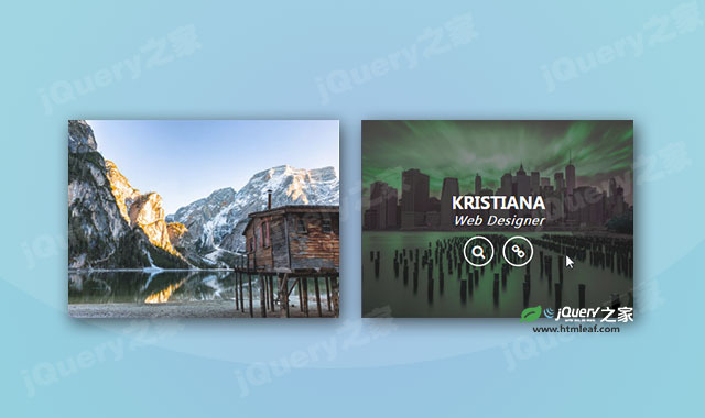
<img src="images/img-2.jpg" alt="">
<div class="box-content">
<h3 class="title">Kristiana</h3>
<span class="post">Web Designer</span>
<ul class="icon">
<li><a href="#"><i class="fa fa-search"></i></a></li>
<li><a href="#"><i class="fa fa-link"></i></a></li>
</ul>
</div>
</div>
</div>
<div class="col-md-4 col-sm-6">
<div class="box">
<img src="images/img-3.jpg" alt="">
<div class="box-content">
<h3 class="title">Steve Thomas</h3>
<span class="post">Web Developer</span>
<ul class="icon">
<li><a href="#"><i class="fa fa-search"></i></a></li>
<li><a href="#"><i class="fa fa-link"></i></a></li>
</ul>
</div>
</div>
</div>
</div>
</div>
CSS样式
然后通过下面的CSS样式来制作鼠标悬停动画效果。
.box{
    overflow: hidden;
    position: relative;
    z-index: 1;
    transition: all 0.3s ease 0s;
}
.box:hover{ box-shadow: 0 0 20px rgba(0,0,0,0.5); }
.box img{
    width: 100%;
    height: auto;
    transition: all 0.3s ease 0s;
}
.box:hover img{ filter: hue-rotate(100deg); }
.box .box-content{
    color: #fff;
    text-align: center;
    width: 100%;
    height: 100%;
    padding: 27% 0 0;
    position: absolute;
    left: 0;
    top: 0;
    z-index: 2;
}
.box:before,
.box:after,
.box .box-content:before,
.box .box-content:after{
    content: '';
    height: 50%;
    width: 50%;
    background-color: rgba(0,0,0,0.5);
    position: absolute;
    left: 0;
    top: 100%;
    transition: all 0.5s;
    z-index: 1;
}
.box:before{ transition-delay: 0.1s; }
.box:after{
    left: 50%;
    transition-delay: 0.2s;
}
.box .box-content:before,
.box .box-content:after{
    z-index: -1;
    top: 100%;
    transition-delay: 0.3s;
}
.box .box-content:after{
    left: 50%;
    transition-delay: 0.35s;
}
.box:hover:before,
.box:hover:after{
    top: 0;
}
.box:hover .box-content:before,
.box:hover .box-content:after{
    top: 50%;
}
.box .title{
    font-size: 22px;
    font-weight: 600;
    text-transform: uppercase;
    margin: 0;
    opacity: 0;
    transform: translateX(-200px);
    transition: all 0.3s ease 0.3s;
}
.box .post{
    font-size:16px;
    font-style: italic;
    letter-spacing: 1px;
    text-transform: capitalize;
    margin-bottom: 10px;
    opacity: 0;
    display: block;
    transform: translateX(-200px);
    transition: all 0.3s ease 0.3s;
}
.box .icon{
    list-style: none;
    text-align: center;
    padding: 0;
    margin: 0;
    opacity: 0;
    z-index: 2;
    transform: translateX(200px);
    transition: all 0.3s ease 0.3s;
}
.box:hover .title,
.box:hover .post,
.box:hover .icon{
    opacity: 1;
    transform: translateX(0);
}
.box .icon li{
    margin: 0 4px;
    display: inline-block;
}
.box .icon li a{
    color: #fff;
    font-size: 18px;
    line-height: 37px;
    height: 40px;
    width: 40px;
    border: 2px solid #fff;
    border-radius: 50%;
    display: block;
    transition: all 0.3s;
}
.box .icon li a:hover{
    background: #f39c12;
    box-shadow: 0 0 10px #f39c12;
}
@media only screen and (max-width:990px){
    .box{ margin-bottom: 30px; }
}
@media only screen and (max-width:479px){
    .box .box-content{ padding: 23% 0 0; }
}


