
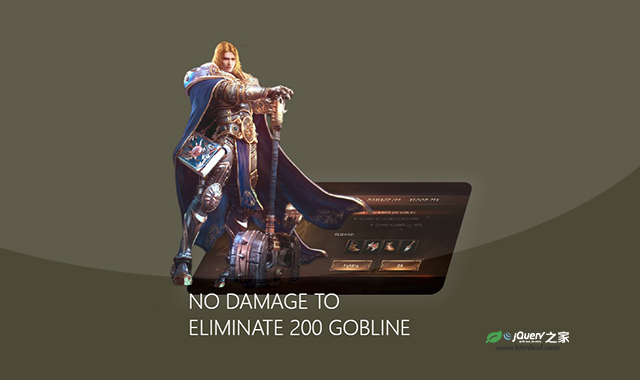

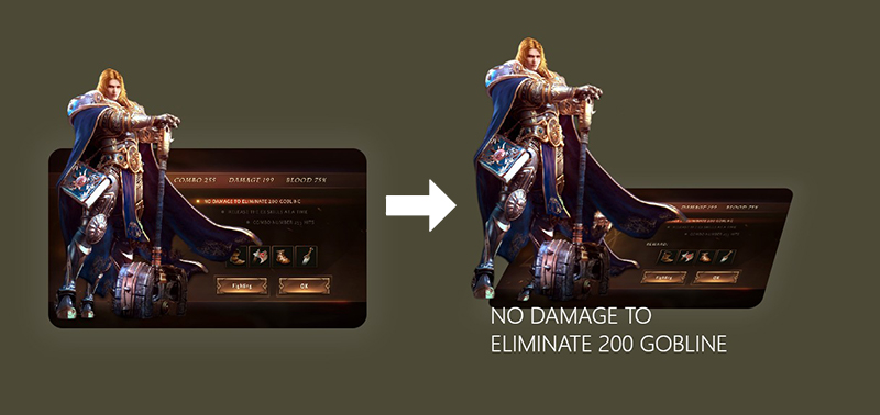
这是一款使用纯CSS3制作的炫酷3D卡片人物展示效果。该3D卡片人物展示效果在鼠标滑过卡片时,卡片上的人物会脱离卡片,并带有放大效果,制作出类似人物离开画面的3D立体效果。
使用方法
HTML代码
<div class="wrap">
    <div class="card">
        <div class="rolebg">
            <img src="img/bg.jpg" alt="">
        </div>
        <div class="role">
            <img src="img/role.png" alt="">
        </div>
        <div class="content">
            <h1>NO DAMAGE TO ELIMINATE 200 GOBLINE</h1>
            <p>PlayStation 4 -Xbox</p>
        </div>
    </div>
</div>
CSS3代码
* {
    margin: 0;
    padding: 0;
    box-sizing: border-box;
}
body {
    background: #4c4937;
}
.wrap {
    width: 100%;
    height: 600PX;
    display: flex;
    justify-content: center;
    align-items: center;
}
.card {
    position: relative;
    width: 440px;
    height: 250px;
}
.rolebg {
    width: 440px;
    height: 250px;
    border-radius: 20px;
    overflow: hidden;
    box-shadow: 0 0 30px 20px rgba(255,255,255,0.05);
    transform-origin: bottom;
    transition: 2s;
}
.rolebg img {
    width: 100%;
    height: 100%;
    object-fit: cover;
}
.role {
    position: absolute;
    bottom: 0;
    width: 300px;
    height: 370px;
    transform-origin: bottom;
    transition: 2s;
}
.role img {
    width: 100%;
    height: 100%;
}
.content {
    position: absolute;
    bottom: -50px;
    width: 440px;
    padding: 10px;
    color: #fff;
    opacity: 0;
    transition: 2s;
}

.content h1 {
    font-weight: 200;
}

.content p {
    padding-top: 10px;
    font-weight: 200;
    font-size: 14px;
}

.card:hover .rolebg {
    transform: perspective(1000px) rotateX(30deg) skewX(-20deg);

}

.card:hover .role {
    transform: scale(1.2);
}

.card:hover .content {
    opacity: 1;
    transform: translateY(90px);
}


