
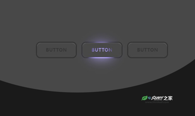

这是一款js和CSS鼠标滑过按钮发光特效。该特效在鼠标滑过按钮时,按钮的边框和文字发出不同颜色的辉光,非常炫酷。
使用方法
HTML代码
<button>
    <span>Button</span>
</button>
CSS代码
*,
*:after,
*:before {
    box-sizing: border-box;
}

:root {
    --x: 0;
    --y: 0;
    --xp: 0;
    --yp: 0;
    --hue: calc(0 + (var(--xp) * 500));
    --bg: hsl(0 0% 10%);
    --size: 100px;
    --glow: radial-gradient(50% 50% at center,
            hsl(var(--hue) 80% 85%),
            hsl(var(--hue) 80% 70%),
            transparent) calc((var(--x) * 1px) - (var(--size) * 0.5)) calc((var(--y) * 1px) - (var(--size) * 0.5)) / var(--size) var(--size) no-repeat fixed;
}

.controls {
    position: fixed;
    top: 2rem;
    right: 2rem;
}

.container {
    display: flex;
    place-items: center;
    gap: 1rem;
    flex-wrap: wrap;
    justify-content: center;
    min-height: 50vh;
    font-family: "SF Pro Text", "SF Pro Icons", "AOS Icons", "Helvetica Neue", Helvetica, Arial, sans-serif, system-ui;
    background: var(--bg);
}

button {
    border-radius: 1rem;
    text-transform: uppercase;
    font-weight: bold;
    letter-spacing: 0.1ch;
    background: var(--bg);
    border: 4px solid transparent;
    box-shadow: 0 1px hsl(0 0% 100% / 0.15) inset;
    cursor: pointer;
    background:
        linear-gradient(var(--bg), var(--bg)) padding-box,
        var(--glow),
        linear-gradient(black, black) border-box;
    transition: background-size 0.24s;
    touch-action: none;
    position: relative;
    padding: 1rem 2rem;
}

button::before {
    content: "";
    position: absolute;
    inset: 0;
    box-shadow: 0 1px hsl(0 0% 100% / 0.15) inset;
    background: var(--bg);
    z-index: 2;
    /*   border: 4px solid transparent; */
    border-radius: 1rem;
}

button span {
    background: var(--glow), black;
    -webkit-background-clip: text;
    background-clip: text;
    color: transparent;
    height: 100%;
    width: 100%;
    z-index: 2;
    position: relative;
    inset: 0;
}

:root:has(button:active) {
    --size: 300px;
}

button::after {
    content: "";
    position: absolute;
    inset: -4px;
    filter: blur(20px);
    border: 4px solid transparent;
    background: var(--glow);
    border-radius: 1rem;
}
codepen网址:https://codepen.io/jh3y/pen/NWJrxMv


