
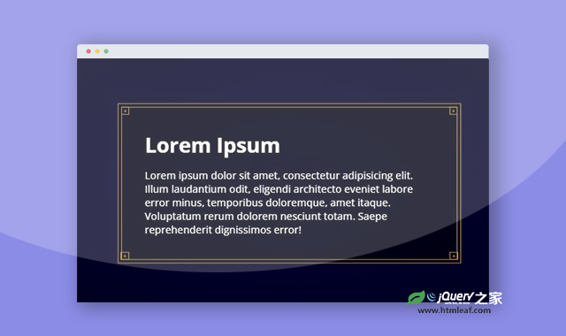

这是一款CSS制作漂亮的矩形边框效果。该矩形边框使用简单的CSS伪元素来制作,通过为盒子添加不同的伪元素,制作出类似复古风格的矩形边框效果,非常炫酷。
使用方法
HTML代码
<div class="container">
    <div class='box'>
        <div class='box-inner'>
            <h1>Lorem Ipsum</h1>
            <p>Lorem ipsum dolor sit amet...</p>
        </div>
    </div>
</div>
CSS代码
* {
    margin: 0;
    padding: 0;
    border: 0;
    box-sizing: border-box;
}

*:before,
*:after {
    box-sizing: border-box;
}

.container {
    position: relative;
    height: 500px;
    background: radial-gradient(#003, #000);
    overflow: hidden;
    color: #fff;
    font-family: "Open Sans";
    font-size: 18px;
}

h1 {
    font-weight: 700;
    margin-bottom: 0.5em;
}

.box {
    position: absolute;
    top: 50%;
    left: 50%;
    transform: translate3d(-50%, -50%, 0);
    background-color: rgba(0, 0, 0, 0.5);
    width: 100%;
    max-width: 600px;
    padding: 5px;
    border: 2px solid #b78846;
}

.box:before,
.box:after {
    content: "•";
    position: absolute;
    width: 14px;
    height: 14px;
    font-size: 14px;
    color: #b78846;
    border: 2px solid #b78846;
    line-height: 12px;
    top: 5px;
    text-align: center;
}

.box:before {
    left: 5px;
}

.box:after {
    right: 5px;
}

.box .box-inner {
    position: relative;
    border: 2px solid #b78846;
    padding: 40px;
}

.box .box-inner:before,
.box .box-inner:after {
    content: "•";
    position: absolute;
    width: 14px;
    height: 14px;
    font-size: 14px;
    color: #b78846;
    border: 2px solid #b78846;
    line-height: 12px;
    bottom: -2px;
    text-align: center;
}

.box .box-inner:before {
    left: -2px;
}

.box .box-inner:after {
    right: -2px;
}
codepen网址:https://codepen.io/MyXoToD/pen/VaazQq


