
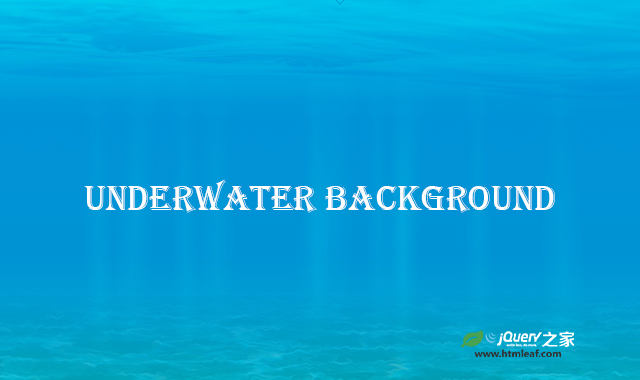

这是一款纯CSS纯净海底背景动画效果。该纯CSS纯净海底背景动画效果使用图片和CSS动画,构造出非常逼真的海底水波荡漾的效果,非常炫酷。
使用方法
HTML代码
<div id='surface'></div>
<div id='caustics'></div>
<div id='bg'></div>
<div id='sun'>
    <div id='sun_layer1'></div>
    <div id='sun_layer2'></div>
    <div id='sun_layer3'></div>
</div>

<svg>
    <filter id="noise1">
        <feTurbulence type="turbulence" baseFrequency=".05" numOctaves="1" seed="3" stitchTiles='stitch' />
        <feDisplacementMap in="SourceGraphic" scale="10" />
    </filter>
</svg>

<main>
    <section></section>
    <section></section>
</main>
CSS代码
:root {
  --ratioW: 1;
}
* {
  margin: 0;
  padding: 0;
  box-sizing: border-box;
}
*::before,
*::after {
  box-sizing: border-box;
}
html,
body {
  overscroll-behavior-x: none;
  overscroll-behavior-y: none;
  scroll-behavior: smooth;
  min-height: 100%;
}
body {
  font-family: "Asap", sans-serif;
  position: relative;
  width: 100vw;
  min-height: 100vh;
  text-align: center;
  overflow-x: hidden;
  background: linear-gradient(
    to bottom,
    oklch(60% 0.2 230),
    oklch(60% 0.2 180)
  );
  color: #333;
  font-size: clamp(12px, 5.5vw, 28px);
}
main {
  position: relative;
}
section {
  position: relative;
  width: 100vw;
  min-height: 100vh;
  display: flex;
  align-items: center;
  justify-content: center;
}
h1,
h2,
p,
figcaption {
  overflow-wrap: break-word;
  max-width: 80vw;
  mix-blend-mode: overlay;
  transform: translate3d(0, 0, 0); /* for safari */
}
a {
  -webkit-text-decoration: underline dotted;
          text-decoration: underline dotted;
  color: currentColor;
}
h2 {
  font-size: 1.3em;
}
ul {
  max-width: 80vw;
  overflow-x: hidden;
  overflow-y: visible;
}
li {
  list-style: none;
  font-size: 0.8em;
  text-align: left;
  margin: 0.8em 0;
}
figure {
  margin: 3rem 0;
  font-size: 0.7em;
  color: currentColor;
}
figure img {
  display: block;
  width: clamp(100px, 50vw, 300px);
  border-radius: 10px;
  filter: drop-shadow(3px 4px 2px rgba(0, 0, 0, 0.2));
  background-color: lightgray;
}
figure a {
  color: currentColor;
}
svg {
  display: none;
}

#bg {
  display: block;
  position: fixed;
  top: 0;
  left: 0;
  width: 100vw;
  height: 100vh;

  background-image: linear-gradient(
    to bottom,
    white,
    gray 25%,
    gray 60%,
    khaki
  );
  opacity: 0.5;
  mix-blend-mode: overlay;
}
#surface {
  mix-blend-mode: overlay;
  position: fixed;
  top: 0;
  left: 0;
  width: 100vw;
  height: 100vh;
}
#surface::before,
#surface::after {
  content: "";
  display: block;
  position: absolute;
  bottom: 0;
  left: 0;
  width: 100vw;
  height: 100vh;
  background-image: url("photo-1518837695005-2083093ee35b");
  background-repeat: repeat-x;

  --duration: 8s;
  --lowHeight: 30vh;
  --highHeight: 70vh;
  --layerNum: 2;
  --index: 0;
  --opacity: 0.4;

  -webkit-animation: surface var(--duration) linear infinite;

          animation: surface var(--duration) linear infinite;
  -webkit-animation-delay: calc(
    (var(--duration) / var(--layerNum)) * var(--index) * -1
  );
          animation-delay: calc(
    (var(--duration) / var(--layerNum)) * var(--index) * -1
  );
  opacity: 0;
  -webkit-mask-image: linear-gradient(to top, white, transparent var(--lowHeight));
          mask-image: linear-gradient(to top, white, transparent var(--lowHeight));
}
#surface::before {
  --index: 0;
  transform: scale3d(1, -1, 1);
}
#surface::after {
  --index: 1;
  transform: scale3d(-1, -1, 1);
}
#caustics {
  position: fixed;
  bottom: 0;
  top: 0;
  width: 100vw;
  height: 100vh;
  filter: url(#noise1);
}
#caustics::before,
#caustics::after {
  content: "";
  display: block;
  position: absolute;
  bottom: 0;
  left: 0;
  width: 100vw;
  height: 100vh;
  background-image: url("photo-1568145675395-66a2eda0c6d7");
  background-repeat: repeat;

  --duration: 10s;
  --gapY: 0px;

  background-size: calc(100vw / var(--ratioW)) 30vh;
  -webkit-animation: caustics calc(var(--duration) * (var(--ratioW))) linear infinite;
          animation: caustics calc(var(--duration) * (var(--ratioW))) linear infinite;
  opacity: 0.3;
  -webkit-mask-image: linear-gradient(
    to top,
    white,
    transparent,
    transparent,
    transparent
  );
          mask-image: linear-gradient(
    to top,
    white,
    transparent,
    transparent,
    transparent
  );
}
#caustics::after {
  --duration: 11s;
  --gapY: 10vh;
  -webkit-animation-delay: -2s;
          animation-delay: -2s;
  transform: scale3d(-1, 1, 1);
}

#sun {
  mix-blend-mode: overlay;
  position: fixed;
  top: 0;
  left: 0;
  width: 100vw;
  height: 100vh;
}
#sun div {
  content: "";
  display: block;
  position: absolute;
  bottom: 0;
  left: 0;
  width: 100%;
  height: 100%;
  transform-origin: 50vw 0;
  -webkit-animation: sun 7s ease infinite alternate;
          animation: sun 7s ease infinite alternate;

  -webkit-mask-image: linear-gradient(
    to bottom,
    transparent 15%,
    white 50%,
    white 55%,
    transparent 80%
  );

          mask-image: linear-gradient(
    to bottom,
    transparent 15%,
    white 50%,
    white 55%,
    transparent 80%
  );
}
#sun #sun_layer1 {
  background: linear-gradient(
    to right,
    transparent 39%,
    white 40%,
    transparent 41%,
    transparent 48.5%,
    white 50%,
    transparent 51.5%,
    transparent 53%,
    white 54%,
    transparent 55%,
    transparent 70%,
    white 71%,
    transparent 72%
  );
}
#sun #sun_layer2 {
  -webkit-animation-delay: -2s;
          animation-delay: -2s;
  -webkit-animation-duration: 7.8s;
          animation-duration: 7.8s;
  animation-direction: alternate-reverse;
  background: linear-gradient(
    to right,
    transparent 32%,
    white 33%,
    transparent 34%,
    transparent 38%,
    white 39%,
    transparent 40%,
    transparent 53%,
    white 54%,
    transparent 55%,
    transparent 63.5%,
    white 65%,
    transparent 66.5%
  );
}
#sun #sun_layer3 {
  -webkit-animation-delay: -5s;
          animation-delay: -5s;
  -webkit-animation-duration: 8.5s;
          animation-duration: 8.5s;
  background: linear-gradient(
    to right,
    transparent 38.5%,
    white 40%,
    transparent 41.5%,
    transparent 47%,
    white 48%,
    transparent 49%,
    transparent 52%,
    white 53%,
    transparent 54%,
    transparent 60%,
    white 61%,
    transparent 62%
  );
}

.arrows {
  width: auto;
  height: auto;
  position: absolute;
  bottom: 0.5rem;
  text-align: center;
  mix-blend-mode: overlay;
}
.arrows div {
  --arrowSize: 1.3rem;
  --arrowColor: currentColor;

  width: var(--arrowSize);
  height: var(--arrowSize);
  margin: calc(var(--arrowSize) * -1.5) 0;
  background: transparent;
  border: calc(var(--arrowSize) * 0.11) solid;
  border-color: transparent transparent var(--arrowColor) var(--arrowColor);
  transform: rotate(-45deg);
  -webkit-animation: arrow 2s infinite linear;
          animation: arrow 2s infinite linear;
}
@-webkit-keyframes arrow {
  0% {
    opacity: 0;
  }
  40% {
    opacity: 1;
  }
  80% {
    opacity: 0;
  }
  100% {
    opacity: 0;
  }
}
@keyframes arrow {
  0% {
    opacity: 0;
  }
  40% {
    opacity: 1;
  }
  80% {
    opacity: 0;
  }
  100% {
    opacity: 0;
  }
}
.arrows div:nth-of-type(3) {
  -webkit-animation-delay: -0.8s;
          animation-delay: -0.8s;
}
.arrows div:nth-of-type(2) {
  -webkit-animation-delay: -0.4s;
          animation-delay: -0.4s;
}
.arrows div:nth-of-type(1) {
  -webkit-animation-delay: 0s;
          animation-delay: 0s;
}

@-webkit-keyframes surface {
  0% {
    opacity: 0;
    background-position: center bottom;
    background-size: 100% var(--highHeight);
  }
  20% {
    opacity: var(--opacity);
  }
  100% {
    opacity: 0;
    background-position: center bottom calc(-1 * var(--lowHeight));
    background-size: 100% var(--lowHeight);
  }
}

@keyframes surface {
  0% {
    opacity: 0;
    background-position: center bottom;
    background-size: 100% var(--highHeight);
  }
  20% {
    opacity: var(--opacity);
  }
  100% {
    opacity: 0;
    background-position: center bottom calc(-1 * var(--lowHeight));
    background-size: 100% var(--lowHeight);
  }
}
@-webkit-keyframes caustics {
  0% {
    background-position: bottom var(--gapY) left;
  }
  100% {
    background-position: bottom var(--gapY) left -100vw;
  }
}
@keyframes caustics {
  0% {
    background-position: bottom var(--gapY) left;
  }
  100% {
    background-position: bottom var(--gapY) left -100vw;
  }
}
@-webkit-keyframes sun {
  0% {
    opacity: 0.1;
    transform: skew(5deg) scale3d(3, 1.5, 1);
  }
  50% {
    opacity: 0.08;
    transform: skew(0deg) scale3d(1.5, 1, 1);
  }
  100% {
    opacity: 0.1;
    transform: skew(-5deg) scale3d(3, 1, 1);
  }
}
@keyframes sun {
  0% {
    opacity: 0.1;
    transform: skew(5deg) scale3d(3, 1.5, 1);
  }
  50% {
    opacity: 0.08;
    transform: skew(0deg) scale3d(1.5, 1, 1);
  }
  100% {
    opacity: 0.1;
    transform: skew(-5deg) scale3d(3, 1, 1);
  }
}
@media (orientation: portrait) {
  :root {
    --ratioW: 1;
  }
}
@media (min-aspect-ratio: 1/1) {
  :root {
    --ratioW: 1;
  }
}
@media (min-aspect-ratio: 2/1) {
  :root {
    --ratioW: 2;
  }
}
@media (min-aspect-ratio: 3/1) {
  :root {
    --ratioW: 3;
  }
}
@media (min-aspect-ratio: 4/1) {
  :root {
    --ratioW: 4;
  }
}
@media (min-aspect-ratio: 5/1) {
  :root {
    --ratioW: 5;
  }
}
codepen网址:https://codepen.io/wakana-k/pen/KKYmxYq


