

这是一款纯css响应式卡片信息展示效果。该卡片信息展示效果在鼠标悬停到卡片上面时,卡片上的图片黑人文字发生动画位移,展现出底层的介绍文字,效果非常炫酷。
使用方法
HTML代码
<div class="wrap animate pop">
<div class="overlay">
<div class="overlay-content animate slide-left delay-2">
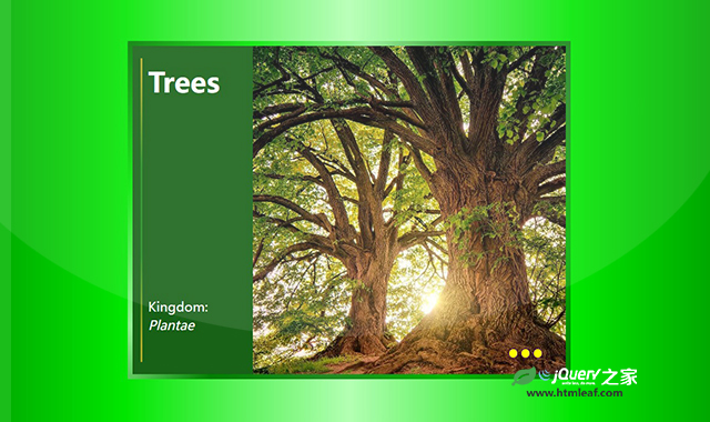
<h1 class="animate slide-left pop delay-4">Trees</h1>
<p class="animate slide-left pop delay-5" style="color: white; margin-bottom: 2.5rem;">Kingdom: <em>Plantae</em></p>
</div>
<div class="image-content animate slide delay-5"></div>
<div class="dots animate">
<div class="dot animate slide-up delay-6"></div>
<div class="dot animate slide-up delay-7"></div>
<div class="dot animate slide-up delay-8"></div>
</div>
</div>
<div class="text">
<p><img class="inset" src="oak_1.jpg" alt="" />Trees are woody perennial plants that are a member of the kingdom <em>Plantae</em>. All species of trees are grouped by their genus, family, and order. This helps make identifying and studying trees easier.</p>
<p>Apart from providing oxygen for the planet and beauty when they bloom or turn color, trees are very useful. Certain species of hardwood and softwood trees are excellent for timber, making furniture, and paper.</p>
<p>When managed properly, trees are a good source of renewable energy and construction material.</p>
</div>
</div>
CSS代码
* {
	padding: 0;
	margin: 0;
	box-sizing: border-box;
}
body {
	min-height: 80vh;
	display: grid;
	place-items: center;
	margin: 0;
	padding: 0;
	background: linear-gradient(
		to right,
		#008000,
		#00e600,
		#b3ffb3,
		#00e600,
		#008000
	);
	font-family: "Martel Sans", sans-serif;
}

h1 {
	font-size: 5.25vmin;
	text-align: center;
	color: white;
}
p {
	font-size: max(10pt, 2.5vmin);
	line-height: 1.4;
	color: #0e390e;
	margin-bottom: 1.5rem;
}

.wrap {
	display: flex;
	flex-wrap: nowrap;
	justify-content: space-between;
	width: 85vmin;
	height: 65vmin;
	margin: 2rem auto;
	border: 8px solid;
	border-image: linear-gradient(
			-50deg,
			green,
			#00b300,
			forestgreen,
			green,
			lightgreen,
			#00e600,
			green
		)
		1;
	transition: 0.3s ease-in-out;
	position: relative;
	overflow: hidden;
}
.overlay {
	position: relative;
	display: flex;
	width: 100%;
	height: 100%;
	padding: 1rem 0.75rem;
	background: #186218;
	transition: 0.4s ease-in-out;
	z-index: 1;
}
.overlay-content {
	display: flex;
	flex-direction: column;
	justify-content: space-between;
	width: 15vmin;
	height: 100%;
	padding: 0.5rem 0 0 0.5rem;
	border: 3px solid;
	border-image: linear-gradient(
			to bottom,
			#aea724 5%,
			forestgreen 35% 65%,
			#aea724 95%
		)
		0 0 0 100%;
	transition: 0.3s ease-in-out 0.2s;
	z-index: 1;
}
.image-content {
	position: absolute;
	top: 0;
	right: 0;
	width: 60vmin;
	height: 100%;
	background-image: url("trees.png");
	background-size: cover;
	transition: 0.3s ease-in-out;
	/* border: 1px solid green; */
}

.inset {
	max-width: 50%;
	margin: 0.25em 1em 1em 0;
	border-radius: 0.25em;
	float: left;
}

.dots {
	position: absolute;
	bottom: 1rem;
	right: 2rem;
	display: flex;
	flex-direction: row;
	justify-content: space-around;
	align-items: center;
	width: 55px;
	height: 4vmin;
	transition: 0.3s ease-in-out 0.3s;
}
.dot {
	width: 14px;
	height: 14px;
	background: yellow;
	border: 1px solid indigo;
	border-radius: 50%;
	transition: 0.3s ease-in-out 0.3s;
}

.text {
	position: absolute;
	top: 0;
	right: 0;
	width: 60vmin;
	height: 100%;
	padding: 3vmin 4vmin;
	background: #fff;
	box-shadow: inset 1px 1px 15px 0 rgba(0 0 0 / 0.4);
	overflow-y: scroll;
}

.wrap:hover .overlay {
	transform: translateX(-60vmin);
}
.wrap:hover .image-content {
	width: 30vmin;
}
.wrap:hover .overlay-content {
	border: none;
	transition-delay: 0.2s;
	transform: translateX(60vmin);
}
.wrap:hover .dots {
	transform: translateX(1rem);
}
.wrap:hover .dots .dot {
	background: white;
}

/* Animations and timing delays */
.animate {
	animation-duration: 0.7s;
	animation-timing-function: cubic-bezier(0.26, 0.53, 0.74, 1.48);
	animation-fill-mode: backwards;
}
/* Pop In */
.pop {
	animation-name: pop;
}
@keyframes pop {
	0% {
		opacity: 0;
		transform: scale(0.5, 0.5);
	}
	100% {
		opacity: 1;
		transform: scale(1, 1);
	}
}

/* Slide In */
.slide {
	animation-name: slide;
}
@keyframes slide {
	0% {
		opacity: 0;
		transform: translate(4em, 0);
	}
	100% {
		opacity: 1;
		transform: translate(0, 0);
	}
}

/* Slide Left */
.slide-left {
	animation-name: slide-left;
}
@keyframes slide-left {
	0% {
		opacity: 0;
		transform: translate(-40px, 0);
	}
	100% {
		opacity: 1;
		transform: translate(0, 0);
	}
}

.slide-up {
	animation-name: slide-up;
}
@keyframes slide-up {
	0% {
		opacity: 0;
		transform: translateY(3em);
	}
	100% {
		opacity: 1;
		transform: translateY(0);
	}
}

.delay-1 {
	animation-delay: 0.3s;
}
.delay-2 {
	animation-delay: 0.6s;
}
.delay-3 {
	animation-delay: 0.9s;
}
.delay-4 {
	animation-delay: 1.2s;
}
.delay-5 {
	animation-delay: 1.5s;
}
.delay-6 {
	animation-delay: 1.8s;
}
.delay-7 {
	animation-delay: 2.1s;
}
.delay-8 {
	animation-delay: 2.4s;
}
codepen网址:https://codepen.io/BlogFire/pen/mdXNMVX


