
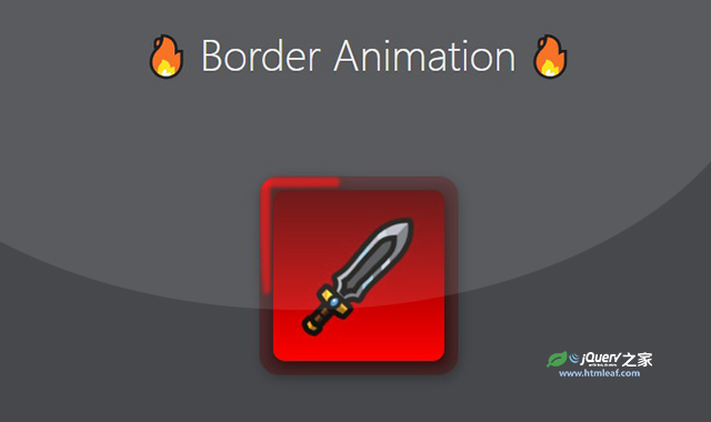

这是一款纯CSS边框环绕运动动画特效。该纯CSS边框环绕运动动画特效使用CSS animation动画,制作出漂亮的线条环绕动画,非常炫酷。
使用方法
HTML代码
* {
    margin: 0;
    padding: 0;
    box-sizing: border-box;
}

html,
body {
    padding: 0;
    margin: 0;
    overflow-x: hidden;
}

html {
    font-size: 62.5%;
}

body {
    background-color: #1f2029;
    color: #ececec;
    font-family: "Montserrat", sans-serif;
    font-weight: 400;
    font-size: 1.4rem;
    text-rendering: optimizeLegibility;
    -webkit-font-smoothing: antialiased;
}

.container {
    display: flex;
    width: 100%;
    min-height: 80vh;
    align-items: center;
    flex-direction: column;
    overflow: hidden;
}

.container h1 {
    width: 100%;
    margin: 20vh 0 10vh 0;
    font-size: clamp(3rem, 4vw, 4rem);
    font-weight: 300;
    color: #ececec;
    text-align: center;
}

.container .avatar__box {
    display: flex;
    width: 20rem;
    height: 20rem;
    align-self: center;
    flex-direction: column;
    border-radius: 2rem;
    filter: drop-shadow(0.2rem 0.4rem 0.6rem rgba(0, 0, 0, 0.75));
    transition: 0.25s ease all;
    overflow: hidden;
}

.container .avatar__box .avatar__box-inner {
    position: relative;
    display: flex;
    width: 100%;
    height: 100%;
    padding: 1em;
    background-color: rgba(92, 0, 0, 0.35);
    overflow: hidden;
}

.container .avatar__box .avatar__box-inner .line {
    position: absolute;
    background: #ff0000;
    filter: blur(0.2rem);
    opacity: 0.7;
}

.container .avatar__box .avatar__box-inner .line:nth-of-type(1) {
    top: 0.1rem;
    left: -100%;
    width: 100%;
    height: 1rem;
    border-top-left-radius: 100%;
    border-top-right-radius: 1rem;
    border-bottom-right-radius: 1rem;
    border-bottom-left-radius: 100%;
    -webkit-animation: animate-left 1s linear infinite;
    animation: animate-left 1s linear infinite;
}

.container .avatar__box .avatar__box-inner .line:nth-of-type(2) {
    top: -100%;
    right: 0.1rem;
    width: 1rem;
    height: 100%;
    border-top-left-radius: 100%;
    border-top-right-radius: 1rem;
    border-bottom-right-radius: 1rem;
    border-bottom-left-radius: 100%;
    -webkit-animation: animate-top 1s linear infinite;
    animation: animate-top 1s linear infinite;
    -webkit-animation-delay: 0.25s;
    animation-delay: 0.25s;
}

.container .avatar__box .avatar__box-inner .line:nth-of-type(3) {
    bottom: 0.1rem;
    right: -100%;
    width: 100%;
    height: 1rem;
    border-top-left-radius: 100%;
    border-top-right-radius: 1rem;
    border-bottom-right-radius: 1rem;
    border-bottom-left-radius: 100%;
    -webkit-animation: animate-right 1s linear infinite;
    animation: animate-right 1s linear infinite;
    -webkit-animation-delay: 0.5s;
    animation-delay: 0.5s;
}

.container .avatar__box .avatar__box-inner .line:nth-of-type(4) {
    bottom: -100%;
    left: 0.1rem;
    width: 1rem;
    height: 100%;
    border-top-left-radius: 100%;
    border-top-right-radius: 1rem;
    border-bottom-right-radius: 1rem;
    border-bottom-left-radius: 100%;
    -webkit-animation: animate-bottom 1s linear infinite;
    animation: animate-bottom 1s linear infinite;
    -webkit-animation-delay: 0.75s;
    animation-delay: 0.75s;
}

.container .avatar__box .avatar__box-inner .avatar {
    position: relative;
    display: flex;
    width: 100%;
    height: 100%;
    border-radius: 1.2rem;
    background: linear-gradient(0deg, #ff0000, #5c0000);
}

.container .avatar__box .avatar__box-inner .avatar::after {
    content: " ";
    position: absolute;
    top: 0;
    left: 0;
    width: 100%;
    height: 100%;
    background-image: url("https://assets.codepen.io/1963991/sword.png");
    background-size: 4rem;
    background-repeat: no-repeat;
    background-position: center center;
    transform: rotate3d(0, 0, 1, 43deg);
}

@-webkit-keyframes animate-left {
    0% {
        left: -100%;
    }

    50%,
    100% {
        left: 100%;
    }
}

@keyframes animate-left {
    0% {
        left: -100%;
    }

    50%,
    100% {
        left: 100%;
    }
}

@-webkit-keyframes animate-top {
    0% {
        top: -100%;
    }

    50%,
    100% {
        top: 100%;
    }
}

@keyframes animate-top {
    0% {
        top: -100%;
    }

    50%,
    100% {
        top: 100%;
    }
}

@-webkit-keyframes animate-right {
    0% {
        right: -100%;
    }

    50%,
    100% {
        right: 100%;
    }
}

@keyframes animate-right {
    0% {
        right: -100%;
    }

    50%,
    100% {
        right: 100%;
    }
}

@-webkit-keyframes animate-bottom {
    0% {
        bottom: -100%;
    }

    50%,
    100% {
        bottom: 100%;
    }
}

@keyframes animate-bottom {
    0% {
        bottom: -100%;
    }

    50%,
    100% {
        bottom: 100%;
    }
}
CSS代码
<div class="container">
    <h1>Border Animation</h1>
    <div class="avatar__box">
        <div class="avatar__box-inner">
            <div class="line"></div>
            <div class="line"></div>
            <div class="line"></div>
            <div class="line"></div>
            <div class="avatar"></div>
        </div>
    </div>
</div>
codepen网址:https://codepen.io/alexdevio/pen/bGJvrya


