
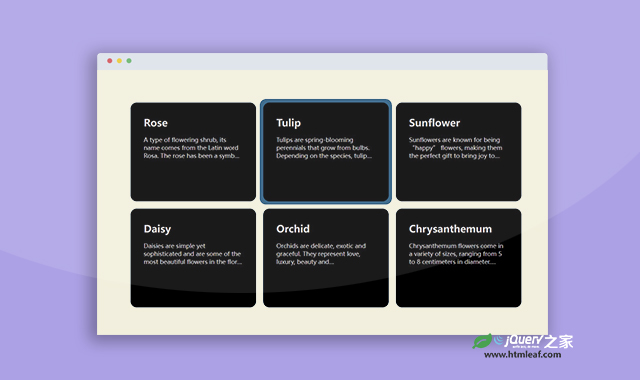

这是一款JS和CSS卡片边框鼠标跟随效果。该特效通过CSS制作卡片的底部边框,并使用简单的JS代码,使边框跟随鼠标进行运动,效果非常炫酷。
使用方法
HTML代码
<section>
    <div class="container max-w-5xl mx-auto px-8">
        <div class="card-wraper">
            <div class="background" id="background"></div>
            <a href="javascript:void(0)" class="card relative group block p-2 h-full w-full">
                <div class="card-main">
                    <div class="card-inner">
                        <div>
                            <h3>Rose</h3>
                            <p>......</p>
                        </div>
                    </div>
                </div>
            </a>
            ......
        </div>
    </div>
</section>
CSS代码
* {
  margin: 0;
  padding: 0;
  box-sizing: border-box;
}
body {
  height: 100svh;
  overflow-x: hidden;
  background-color: #000;
  color: #e7e7e7;

  font-family: "Lato", sans-serif;
  font-weight: 400;
}
section {
  height: 100%;
}
.container {
  max-width: 1200px;
  margin: 0 auto;
  padding: 40px 0;
  display: flex;
  align-items: center;
  justify-content: center;
  height: 100%;
  min-height: 710px;
}
h3 {
  font-size: 30px;
  margin-bottom: 20px;
  font-weight: 600;
  color: #d3d1d1;
}
p {
  font-size: 18px;
  font-weight: 400;
  color: #d3d1d1;
  overflow: hidden;
  text-overflow: ellipsis;
  display: -webkit-box;
  -webkit-line-clamp: 3;
  -webkit-box-orient: vertical;
}
a.zoomed p {
  -webkit-line-clamp: unset;
}
a.zoomed .card-inner {
  overflow: auto;
}
a.opacity-0 {
  opacity: 0;
}
.overflow {
  overflow: hidden;
}
.overflow .background {
  opacity: 0 !important;
}

.background {
  background-color: #2c5c7f;
  border-radius: 20px;
  position: absolute;
  transition: all 0.4s ease-in-out;
  opacity: 0;
}
.card-wraper {
  display: grid;
  grid-template-columns: repeat(3, minmax(0, 1fr));
  justify-content: space-between;
}
a.card {
  text-decoration: none;
  height: 100%;
  width: 100%;
  display: inline-block;
  position: relative;
  padding: 10px;
}
.card-main {
  border: 1px solid #1a5582;
  padding: 40px;
  width: 100%;
  height: 100%;
  min-height: 300px;
  border-radius: 20px;
  overflow: hidden;
  background-color: #000;
}
.card:hover .card-main {
  position: relative;
  z-index: 20;
}
.card-inner {
  position: relative;
  z-index: 50;
  height: 100%;
}
.card-inner div {
  height: 100%;
}
img {
  height: 100%;
  width: 100%;
}

@media screen and (max-width: 1199px) {
  .container {
    max-width: 960px;
  }
}

@media screen and (max-width: 991px) {
  body {
    height: 100%;
  }
  .container {
    max-width: 720px;
    display: block;
  }
  .card-wraper {
    grid-template-columns: repeat(2, minmax(0, 1fr));
  }
}

@media screen and (max-width: 767px) {
  .container {
    max-width: 520px;
  }
  .card-wraper {
    grid-template-columns: repeat(2, minmax(0, 1fr));
  }
  .card-main {
    padding: 30px 20px;
  }
  a.card {
    padding: 6px;
  }
}

@media screen and (max-width: 575px) {
  .container {
    max-width: 100%;
  }
  .card-wraper {
    grid-template-columns: repeat(1, minmax(0, 1fr));
  }
  .card-main {
    padding: 40px;
  }
  a.card {
    padding: 10px;
  }
}


