
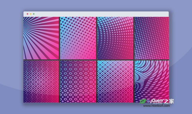

这是一款纯CSS科技感卡片背景效果。该纯CSS科技感卡片背景效果使用CSS渐变来制作不同的线条效果,科技感十足,共20种不同背景,效果非常炫酷。
使用方法
HTML代码
<div class="container">
    <div class='card'></div>
    <div class='card'></div>
    <div class='card'></div>
    <div class='card'></div>
    <div class='card'></div>
    <div class='card'></div>
    <div class='card'></div>
    <div class='card'></div>
    <div class='card'></div>
    <div class='card'></div>
    <div class='card'></div>
    <div class='card'></div>
    <div class='card'></div>
    <div class='card'></div>
    <div class='card'></div>
    <div class='card'></div>
    <div class='card'></div>
    <div class='card'></div>
    <div class='card'></div>
    <div class='card'></div>
</div>
CSS代码
.container {
  display: grid;
  grid-gap: 0.5em;
  grid-template-columns: repeat(auto-fit, min(100%, 13em));
  place-content: center;
  background: #333;
}

.card {
  overflow: hidden;
  position: relative;
  padding: min(85%, 9.75em) 0;
  border-radius: 5px;
  box-shadow: 2px 2px 5px rgba(0, 0, 0, 0.5);
  background: linear-gradient(to left top, #ec014b, #06cced);
  isolation: isolate;
}
.card::before, .card::after {
  position: absolute;
  top: 0;
  right: 0;
  bottom: 0;
  left: 0;
  z-index: 0;
  content: "";
}
.card::before {
  background: repeating-linear-gradient(45deg, #000, #999, #000 5%), linear-gradient(45deg, #777, #000);
  background-blend-mode: screen;
  filter: contrast(19);
  mix-blend-mode: multiply;
}
.card::after {
  background: linear-gradient(90deg, #251967, #d0135e);
  mix-blend-mode: screen;
}

.card:nth-child(2)::before {
  background: repeating-radial-gradient(circle at 0 50%, #000, #999, #000 5%), radial-gradient(circle at 0 50%, #777, #000);
}

.card:nth-child(3)::before {
  background: repeating-conic-gradient(at -9% 25%, #000, #999, #000 2.5%), conic-gradient(at -9% 25%, #000, #777 50%);
}

.card:nth-child(4)::before {
  background: repeating-linear-gradient(30deg, #000, #999, #000 5%), repeating-linear-gradient(-60deg, #000, #999, #000 5%), linear-gradient(30deg, #777, #000);
}

.card:nth-child(5)::before {
  background: linear-gradient(#777, #000), repeating-radial-gradient(circle at -35% 0, #000, #999, #000 5%), repeating-radial-gradient(circle at -35% 100%, #000, #999, #000 5%);
  background-blend-mode: screen, difference;
}

.card:nth-child(6)::before {
  background: linear-gradient(30deg, #777, #000), repeating-linear-gradient(30deg, #000, #999, #000 5%), repeating-linear-gradient(-60deg, #000, #999, #000 5%);
  background-blend-mode: screen, difference;
}

.card:nth-child(7)::before {
  background: linear-gradient(30deg, #777, #000), repeating-linear-gradient(30deg, #000, #999, #000 5%), repeating-conic-gradient(#000, #999, #000 5%);
  background-blend-mode: screen, difference;
}

.card:nth-child(8)::before {
  background: linear-gradient(30deg, #777, #000), repeating-linear-gradient(30deg, #000, #999, #000 5%), repeating-radial-gradient(circle at 100% 50%, #000, #999, #000 5%);
  background-blend-mode: screen, difference;
}

.card:nth-child(9)::before {
  background: radial-gradient(circle, #777, #000), repeating-linear-gradient(-45deg, #000, #999, #000 5%), repeating-linear-gradient(45deg, #000, #999, #000 5%);
  background-blend-mode: screen, difference;
}

.card:nth-child(10)::before {
  background: conic-gradient(#777, #000), repeating-linear-gradient(-45deg, #000, #999, #000 5%), repeating-linear-gradient(45deg, #000, #999, #000 5%);
  background-blend-mode: screen, difference;
}

.card:nth-child(11)::before {
  background: radial-gradient(circle, #000, #666 70%), radial-gradient(circle, #000, #fff, #000 71%) 0 0/2em 2em round, radial-gradient(circle, #000, #fff, #000 71%) 1em 1em/2em 2em round;
  background-blend-mode: difference;
}

.card:nth-child(12)::before {
  background: linear-gradient(-15deg, #000, #666), radial-gradient(circle, #fff, #000 65%) 0 0/2em 2em round, radial-gradient(circle, #000, #fff, #000 65%) 1em 1em/2em 2em round;
  background-blend-mode: difference;
}

.card:nth-child(13)::before {
  background: linear-gradient(#777, #000), radial-gradient(circle, #000, #999, #000 65%) 0 0/2em 2em round, radial-gradient(circle, #000, #999, #000 65%) 1em 1em/2em 2em round;
  background-blend-mode: screen, difference;
}

.card:nth-child(14)::before {
  background: conic-gradient(at 0 50%, #777, #000), repeating-radial-gradient(circle at 0 0, #000, #999, #000 5%), repeating-conic-gradient(at -5% 50%, #000, #999, #000 5%);
  background-blend-mode: screen, difference;
}

.card:nth-child(15)::before {
  background: repeating-linear-gradient(45deg, #000, #999, #000 5%) 0/50% no-repeat, repeating-linear-gradient(-45deg, #000, #999, #000 5%) 100%/50% no-repeat, linear-gradient(#777, #000);
}

.card:nth-child(16)::before {
  background: radial-gradient(circle, #888, #000), repeating-radial-gradient(circle at 0 100%, #000, #888, #000 5%) 0 0/100% 50% no-repeat, repeating-radial-gradient(circle at 100% 0, #000, #888, #000 5%) 0 100%/100% 50% no-repeat;
  background-blend-mode: screen;
}

.card:nth-child(17)::before {
  background: radial-gradient(#000, #fff 70%) 0.75em 0.75em, conic-gradient(from -90deg at 15% 50%, #fff, #000 5% 30%, #fff 35%), conic-gradient(at 50% 15%, #fff, #000 5% 30%, #fff 35%), conic-gradient(from 90deg at 85% 50%, #fff, #000 5% 30%, #fff 35%), conic-gradient(from 180deg at 50% 85%, #fff, #000 5% 30%, #fff 35%);
  background-size: 1.5em 1.5em;
  background-blend-mode: difference, multiply, multiply, multiply;
}

.card:nth-child(18)::before {
  background: linear-gradient(#777, #000), repeating-conic-gradient(#ddd, #000 12.5% 37.5%, #ddd 50%) 0/1em 1em;
}

.card:nth-child(19)::before {
  background: radial-gradient(circle, #000, #777), repeating-radial-gradient(circle, #ddd, #000, #ddd 5%), repeating-conic-gradient(#ddd, #000, #ddd 5%);
  background-blend-mode: screen, difference;
}

.card:nth-child(20)::before {
  background: repeating-linear-gradient(45deg, #000, #666, #000 20%), repeating-radial-gradient(circle, #ddd, #000, #ddd 5%), repeating-conic-gradient(#ddd, #000, #ddd 5%);
  background-blend-mode: screen, difference;
}


