
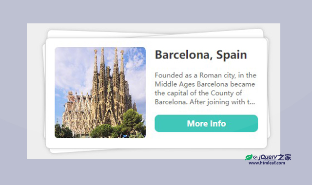

这是一款纯CSS堆叠卡片展开动画特效。该特效使用css将几个div层堆叠在一起,当鼠标悬停在上面时,图层垂直展开,非常炫酷。
使用方法
HTML代码
<div class="flex-wrapper">
    <div class="item">
        <img src="./img/1.jpg" />
        <div class="innerContent">
            <h2>....</h2>
            <p>...</p>
            <button>More info</button>
        </div>
    </div>
    <div class="item">
        <img src="./img/2.jpg" />
        <div class="innerContent">
            <h2>....</h2>
            <p>....</p>
            <button>More Info</button>
        </div>
    </div>
    <div class="item">
        <img src="./img/3.jpg" />
        <div class="innerContent">
            <h2>....</h2>
            <p>....</p>
            <button>More Info</button>
        </div>
    </div>
</div>
CSS代码
:root {
  --sizeVar: 10px;
}
.container {
  background-color: #eeeeee;
  position: absolute;
  display: flex;
  inset: 32px;
  justify-content: center;
  align-items: center;
}
.flex-wrapper {
  width: calc(var(--sizeVar) * 40);
  display: flex;
  flex-direction: column;
  gap: calc(var(--sizeVar) * 1.2);
}
.flex-wrapper:hover .item {
  margin-top: 0;
  transform: rotate(0deg);
}
.item:nth-of-type(1) {
  margin-top: 0 !important;
}
.item h2 {
  margin: 0;
  color: #333333;
  font-family: "Poppins", sans-serif;
  font-weight: 600;
  font-style: normal;
  font-size: calc(var(--sizeVar) * 2);
}
.item img {
  width: calc(var(--sizeVar) * 16.4);
  height: calc(var(--sizeVar) * 16.4);
  aspect-ratio: 1 / 1;
  -o-object-fit: cover;
     object-fit: cover;
  border-radius: calc(var(--sizeVar) * 0.6);
}
.item .innerContent {
  display: flex;
  flex-direction: column;
  height: calc(var(--sizeVar) * 16.4);
  gap: calc(var(--sizeVar) * 0.4);
}
.item p {
  display: -webkit-box;
  -webkit-box-orient: vertical;
  -webkit-line-clamp: 4;
  overflow: hidden;
  text-overflow: ellipsis;
  color: #666666;
  font-family: "Poppins", sans-serif;
  font-weight: 400;
  font-style: normal;
  font-size: calc(var(--sizeVar) * 1.2);
}
.item button {
  border-radius: calc(var(--sizeVar) * 0.8);
  border: none;
  background-color: #35c4b6;
  color: #ffffff;
  padding: calc(var(--sizeVar) * 0.6);
  font-family: "Poppins", sans-serif;
  font-weight: 600;
  font-style: normal;
  font-size: calc(var(--sizeVar) * 1.4);
  cursor: pointer;
}
.item button:hover {
  background-color: #40e0d0;
  box-shadow: 0 0 calc(var(--sizeVar) * 1.2) #40e0d088;
}
.item button:active {
  background-color: #40e0d0;
  box-shadow: none;
}
.item {
  display: flex;
  gap: calc(var(--sizeVar) * 1.6);
  width: 100%;
  height: calc(var(--sizeVar) * 20);
  padding: calc(var(--sizeVar) * 1.6);
  box-sizing: border-box;
  background: #ffffff;
  border-radius: calc(var(--sizeVar) * 0.8);
  border: 1px solid lightgray;
  box-shadow: 0 0 calc(var(--sizeVar) * 0.6) #00000022;
  margin-top: calc(var(--sizeVar) * -20.8);
  transform: rotate(2deg);
  cursor: pointer;
  -webkit-user-select: none;
     -moz-user-select: none;
      -ms-user-select: none;
          user-select: none;
  transition: margin-top 300ms ease-in-out 0s, transform 300ms ease-in-out 0s;
}
.item:nth-of-type(2) {
  transform: rotate(-4deg);
}
.item:nth-of-type(3) {
  transform: rotate(0deg);
}
.item:hover {
  border-color: #40e0d0;
  box-shadow: 0 0 calc(var(--sizeVar) * 1.2) #40e0d088;
}

@media screen and (max-width: 600px) {
  :root {
    --sizeVar: 6px;
  }
}


