
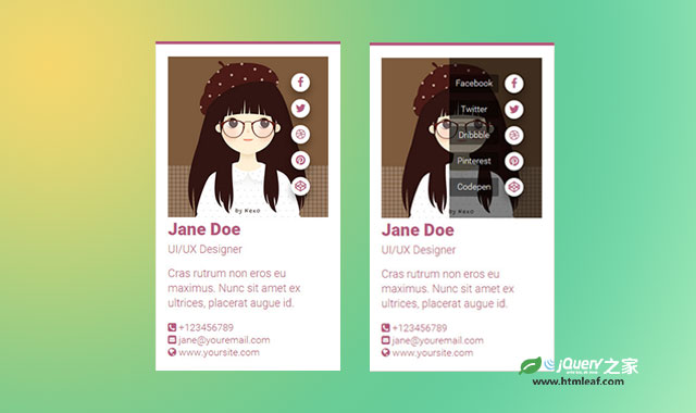

这是一款非常时尚的纯CSS3炫酷手机APP滑动菜单动画特效。该特效中当鼠标移动到手机界面上时,菜单图标会逐个滑动显示出来。当鼠标移动到菜单区域会出现一个非常酷的半圆形扩展动画,同时菜单文字将逐一展现出来。
制作方法
HTML结构
该手机滑动菜单动画特效的主要部分是菜单图标和菜单项的展示。这里使用一个嵌套<div>结构,菜单项有超链接<a>元素来制作。
<div class="social">
  <div class="list">
    <a href="#" data-title="Facebook"><i class="fa fa-facebook"></i></a>
    <a href="#" data-title="Twitter"><i class="fa fa-twitter"></i></a>
    <a href="#" data-title="Dribbble"><i class="fa fa-dribbble"></i></a>
    <a href="#" data-title="Pinterest"><i class="fa fa-pinterest"></i></a>
    <a href="#" data-title="Codepen"><i class="fa fa-codepen"></i></a>
  </div>
</div>

CSS样式
开始的时候,菜单使用right: -10px;隐藏起来。
.fresh-ui .header .social .list {
  right: -10px;
  z-index: 999;
  position: absolute;
}
在鼠标滑过的时候在将这个菜单列表移回屏幕之中。
.fresh-ui:hover .header .social .list {
  right: 15px;
}

.fresh-ui:hover .header .social .list a {
  -webkit-transform: translateX(-15px);
  -ms-transform: translateX(-15px);
      transform: translateX(-15px);
}
每个菜单项都通过nth-child旋转器来选择然后添加延迟时间。
.fresh-ui .header .social .list a:nth-child(1),
.fresh-ui .header .social .list a:nth-child(1):before {
  -webkit-transition-duration: .1s;
  transition-duration: .1s;
}
...
半透明的遮罩层使用social元素的:after伪元素来制作。
.fresh-ui .header .social:after {
  top: 0;
  left: 150px;
  content: '';
  width: 300px;
  height: 260px;
  position: absolute;
  background: rgba(0, 0, 0, .5);
  border-top-left-radius: 50%;
  border-bottom-left-radius: 50%;
  -webkit-transition: all .35s ease-in-out 0s;
          transition: all .35s ease-in-out 0s;
}
在鼠标滑过屏幕上方的header元素时将移动它的left属性,制作动画效果。
.fresh-ui .header:hover .social:after {
  left: -150px;
}


