
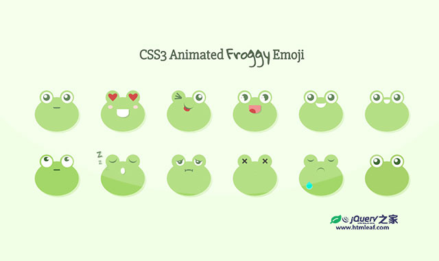

这是一组使用纯CSS3制作的青蛙表情符号动画特效。这组青蛙表情符号共12种表情,表情符号通过CSS3 transform和animation来制作动画效果。
使用方法
HTML结构
最基本的青蛙表情符号的HTML结构如下:
<div class="icon">
  <div class="frog" id="frog-1">

    <div class="body">
      <div class="mouth"></div>
    </div>

    <div class="eyes">
      <div class="eye eye-left">
        <div class="eye-inner">
          <div class="pupil">
            <div class="light"></div>
          </div>
        </div>
      </div>
      <div class="eye eye-right">
        <div class="eye-inner">
          <div class="pupil">
            <div class="light"></div>
          </div>
        </div>
      </div>
    </div>

  </div>
</div>
在HTML文件中,每一个<div.icon>元素对应一种表情符号。
CSS样式
青蛙样式的通用CSS代码如下:
.icon {
  width: 125px;
  height: 120px;
  position: relative;
}
.icon .frog {
  position: absolute;
  top: 0;
  left: 0;
  width: 100%;
  height: 100%;
}
.icon .frog .body {
  width: 110px;
  height: 86px;
  background-color: #A3D768;
  border-radius: 50%;
  position: absolute;
  top: 25px;
  left: 0;
  right: 0;
  margin: auto;
  box-shadow: 4px 4px 0px 0px rgba(163, 215, 104, 0.3);
}
.icon .frog .body .mouth {
  margin: auto;
}
.icon .frog .body .big-mouth {
  width: 30px;
  height: 20px;
  border-radius: 0 0 50% 50%;
  box-shadow: 2px 2px 0px 0px rgba(63, 106, 52, 0.3);
}
.icon .frog .body .blush {
  width: 75px;
  height: 9px;
  position: absolute;
  top: 20px;
  left: 0;
  right: 0;
  margin: auto;
}
.icon .frog .body .blush:before, .icon .frog .body .blush:after {
  content: "";
  display: block;
  width: 12px;
  height: 100%;
  background-color: #F7D2C9;
  border-radius: 50%;
}
.icon .frog .body .blush:before {
  position: absolute;
  top: 0;
  left: 0;
}
.icon .frog .body .blush:after {
  position: absolute;
  top: 0;
  right: 0;
}
.icon .frog .eyes {
  width: 86px;
  height: 35px;
  position: absolute;
  top: 8px;
  left: 0;
  right: 0;
  margin: auto;
}
.icon .frog .eyes .eye {
  width: 35px;
  height: 35px;
}
.icon .frog .eyes .eye:before {
  content: "";
  display: block;
  width: 100%;
  height: 100%;
  background-color: #A3D768;
  border-radius: 50%;
}
.icon .frog .eyes .eye.wink .eye-inner {
  background-color: transparent;
  width: 17px;
  height: 3px;
  background-color: #3F6A34;
  border-radius: 0;
  position: absolute;
  top: 15px;
  left: 0;
  right: 0;
  margin: auto;
  -webkit-transform: rotate(21deg);
          transform: rotate(21deg);
}
.icon .frog .eyes .eye.wink .eye-inner:before, .icon .frog .eyes .eye.wink .eye-inner:after {
  content: '';
  display: block;
  width: 17px;
  height: 3px;
  background-color: #3F6A34;
}
.icon .frog .eyes .eye.wink .eye-inner:before {
  -webkit-transform: rotate(25deg);
          transform: rotate(25deg);
  position: absolute;
  top: -4px;
  left: 0;
}
.icon .frog .eyes .eye.wink .eye-inner:after {
  -webkit-transform: rotate(-25deg);
          transform: rotate(-25deg);
  position: absolute;
  top: 4px;
  left: 0;
}
.icon .frog .eyes .eye.wink .pupil {
  display: none;
}
.icon .frog .eyes .eye.extra-light .light {
  width: 40%;
  height: 40%;
}
.icon .frog .eyes .eye.extra-light .light:before {
  content: "";
  display: block;
  width: 70%;
  height: 70%;
  background-color: #fff;
  border-radius: 50%;
}
.icon .frog .eyes .eye .eye-inner {
  background-color: #fff;
  width: 80%;
  height: 80%;
  position: absolute;
  top: 10%;
  left: 10%;
  border-radius: 50%;
}
.icon .frog .eyes .eye .eye-inner .pupil {
  background-color: #3F6A34;
  width: 60%;
  height: 60%;
  position: absolute;
  top: 20%;
  left: 20%;
  border-radius: 50%;
}
.icon .frog .eyes .eye .eye-inner .pupil .light {
  background-color: #fff;
  width: 50%;
  height: 50%;
  position: absolute;
  top: 10%;
  left: 10%;
  border-radius: 50%;
}
.icon .frog .eyes .eye-left {
  position: absolute;
  top: 0px;
  left: 0;
}
.icon .frog .eyes .eye-right {
  position: absolute;
  top: 0px;
  right: 0;
}
青蛙表情的动画效果通过CSS3 transform和animation来制作,具体代码请参考源文件。


