
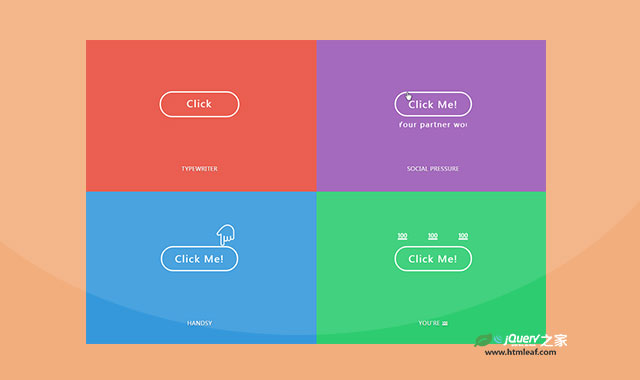

这是一款CSS3按钮动画特效。在该特效中,提供了8种按钮动画特效。每种特效在鼠标悬停到按钮上面的时候,都会触发按钮动画。
使用方法
HTML结构
最简单的按钮HTML结构如下。
<div class="item button-jittery" style="--bg-color: #f1c40f;">
  <button>Click Me!</button>
  <div class="name">Subtlety</div>
</div>
CSS样式
* {
  box-sizing: border-box;
}
*:before, *:after {
  content: "";
  position: absolute;
}

.main-content {
  display: grid;
  width: 100%;
  grid-template-columns: repeat(auto-fit, minmax(400px, 1fr));
}
.main-content .item {
  display: grid;
  grid-template-rows: 1fr min-content;
  align-items: center;
  justify-content: center;
  height: 50vh;
  flex-wrap: wrap;
  background: var(--bg-color);
}
.main-content .item:not(.footer) {
  padding-top: 1rem;
}

button {
  background: transparent;
  color: #fff;
  border: 3px solid #fff;
  border-radius: 50px;
  padding: 0.8rem 2rem;
  font: 24px "Margarine", sans-serif;
  outline: none;
  cursor: pointer;
  position: relative;
  transition: 0.2s ease-in-out;
  letter-spacing: 2px;
}

.name {
  width: 100%;
  text-align: center;
  padding: 0 0 3rem;
  font: 500 14px 'Rubik', sans-serif;
  letter-spacing: .5px;
  text-transform: uppercase;
  text-shadow: 0 1px 1px rgba(0, 0, 0, 0.4);
}

.button__wrapper {
  display: inline-block;
  position: relative;
  width: 200px;
  height: 65px;
  display: flex;
  justify-content: center;
  align-items: center;
}

.button-pulse button {
  background: var(--bg-color);
  width: 100%;
  height: 100%;
  position: absolute;
  top: 0;
  left: 0;
  z-index: 2;
}
.button-pulse .button__wrapper:hover .pulsing:before {
  animation: pulsing 0.2s linear infinite;
}
.button-pulse .button__wrapper:hover .pulsing:after {
  animation: pulsing1 0.2s linear infinite;
}

.pulsing {
  width: 99%;
  height: 99%;
  border-radius: 50px;
  z-index: 1;
  position: relative;
}
.pulsing:before, .pulsing:after {
  width: 100%;
  height: 100%;
  border: inherit;
  top: 0;
  left: 0;
  z-index: 0;
  background: #fff;
  border-radius: inherit;
  animation: pulsing 2.5s linear infinite;
}
.pulsing:after {
  animation: pulsing1 2.5s linear infinite;
}
.button-jittery button {
  animation: jittery 4s infinite;
}
.button-jittery button:hover {
  animation: heartbeat 0.2s infinite;
}

@keyframes jittery {
  5%,
  50% {
    transform: scale(1);
  }
  10% {
    transform: scale(0.9);
  }
  15% {
    transform: scale(1.15);
  }
  20% {
    transform: scale(1.15) rotate(-5deg);
  }
  25% {
    transform: scale(1.15) rotate(5deg);
  }
  30% {
    transform: scale(1.15) rotate(-3deg);
  }
  35% {
    transform: scale(1.15) rotate(2deg);
  }
  40% {
    transform: scale(1.15) rotate(0);
  }
}
@keyframes heartbeat {
  50% {
    transform: scale(1.1);
  }
}
该CSS3按钮动画特效的codepen网址为:https://codepen.io/oliviale/pen/vPvvyr


