
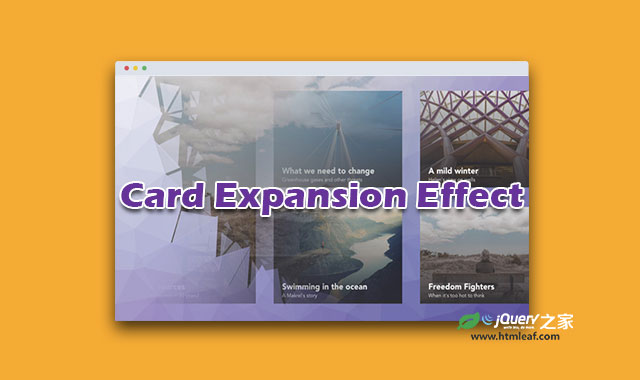

这是codrops出品的一款HTML5 SVG clipPath炫酷卡片膨胀动画特效。该特效采用网格卡片布局,当用户点击其中一张卡片的时候,伴随一个非常酷的运动效果,它会切换到另一个页面,并变形为封面图片。
该特效的背景网格采用Trianglify插件来制作。使用SVG clipPath来制作卡片的路径变形动画,并使用GSAP来控制和管理整个动画序列。
由于并不是所有的浏览器都支持使用CSS clip-path来剪裁和变形图片,特效中使用SVG clipPath来作为替代。这样可以使这个特效在所有现代浏览器上正常工作,包括IE9。
制作方法
每一个卡片有两种状态:显示和隐藏。下面是卡片的解绑HTML结构:
<div class="card">
  <div class="card__container">
    <svg class="card__image">
      <!-- SVG image... -->
    </svg>
    <div class="card__content">
      <i class="card__btn-close fa fa-times"></i>
      <div class="card__caption">
        <h2 class="card__title">Title...</h2>
        <p class="card__subtitle">Subtitle...</p>
      </div>
      <p class="card__copy">
        Lorem ipsum dolor sit amet...
      </p>
    </div>
  </div>
</div>
基本的CSS样式如下:
.card {
  position: relative;
  float: left;
  width: 29%;
  height: 0;
  margin: 2%;
  padding-bottom: 20%;
}

.card__container {
  position: fixed;
  top: 0;
  left: 0;
  overflow-x: hidden;
  overflow-y: auto;
  width: 100%;
  height: 100%;
  -webkit-overflow-scrolling: touch;
}
对于隐藏状态的卡片,特效中设置卡片容器的单位为绝对定位。
.card__container--closed {
  position: absolute;
  overflow: hidden;
}
为了切换卡片的两种状态,特效中简单的获取卡片的位置,然后将它变为全屏,并将container中的内容放到它里面。
Card.prototype._floatContainer = function(callback) {

    $(document.body).css('overflow', 'hidden');

    var TL = new TimelineLite;

    // Get the card position on the viewport.
    var rect = this._container.getBoundingClientRect();
    var windowW = window.innerWidth;

    var track = {
      width: 0,
      x: rect.left + (rect.width / 2),
      y: rect.top + (rect.height / 2),
    };

    // Fix the container to the card position (start point).
    TL.set(this._container, {
      width: rect.width,
      height: rect.height,
      x: rect.left,
      y: rect.top,
      position: 'fixed',
      overflow: 'hidden'
    });

    // Tween the container (and the track values) to full screen (end point).
    TL.to([this._container, track], 2, {
      width: windowW, // This value must be in px in order to correctly update the track width.
      height: '100%',
      x: windowW / 2,
      y: 0,
      xPercent: -50,
      ease: Expo.easeInOut,
      clearProps: 'all',
      className: '-=' + CLASSES.containerClosed,
      onUpdate: callback.bind(this, track)
    });

    return TL;
  };
其它代码请参考源文件。


