
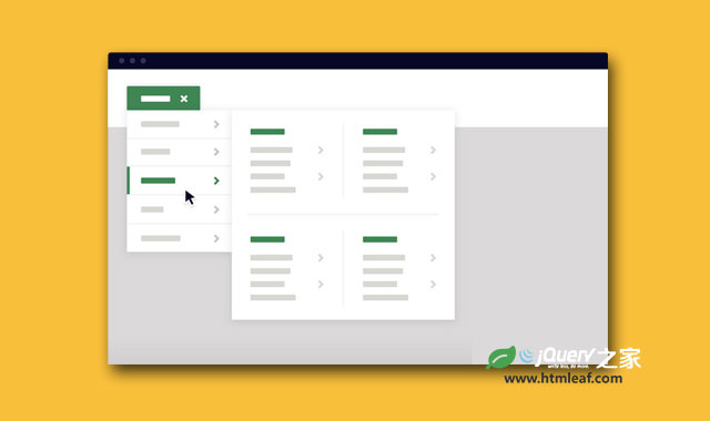

这是一款非常实用的jQuery和CSS3响应式多用途多级下拉菜单插件。该下拉菜单插件可以将目录进行分组多级展示,可以以网格形式展示缩略图,还可以使用图标和文字混搭,适合于网站目录或产品目录较多的站点使用。
该下拉菜单插件可以在桌面设备和移动手机设备上正常工作,但两种情况下的下拉菜单表现形式有所不同,来看下面的图片:
在这个插件中,下拉菜单是通过鼠标点击或用手触摸下拉菜单按钮来触发的。
制作方法
HTML结构
这个下拉菜单插件的HTML结构分为2个主要部分:一个是<header>元素,包含下拉菜单组件。一个是<main>元素,用于放置页面的内容。
.cd-dropdown-wrapper元素中包含一个.cd-dropdown-trigger元素,用于触发下拉菜单。还有一个.cd-dropdown元素,它包含了多级嵌套的无序列表元素。
<header>
  <div class="cd-dropdown-wrapper">
    <a class="cd-dropdown-trigger" href="#0">Dropdown</a>
    <nav class="cd-dropdown">
      <h2>Title</h2>
      <a href="#0" class="cd-close">Close</a>
      <ul class="cd-dropdown-content">
        <li>
          <form class="cd-search">
            <input type="search" placeholder="Search...">
          </form>
        </li>
        <li class="has-children">
          <a href="#0">Clothing</a>

          <ul class="cd-secondary-dropdown is-hidden">
            <li class="go-back"><a href="#0">Menu</a></li>
            <li class="see-all"><a href="#0">All Clothing</a></li>
            <li class="has-children">
              <a href="#0">Accessories</a>

              <ul class="is-hidden">
                <li class="go-back"><a href="#0">Clothing</a></li>
                <li class="see-all"><a href="#0">All Accessories</a></li>
                <li class="has-children">
                  <a href="#0">Beanies</a>

                  <ul class="is-hidden">
                    <li class="go-back"><a href="#0">Accessories</a></li>
                    <li class="see-all"><a href="#0">All Benies</a></li>
                    <li><a href="#0">Caps & Hats</a></li>
                    <!-- other list items here -->
                  </ul>
                </li>
                <li class="has-children">
                  <a href="#0">Caps & Hats</a>

                  <ul class="is-hidden">
                    <li class="go-back"><a href="#0">Accessories</a></li>
                    <li class="see-all"><a href="#0">All Caps & Hats</a></li>
                    <li><a href="#0">Beanies</a></li>
                    <!-- other list items here -->
                  </ul>
                </li>
                <li><a href="#0">Glasses</a></li>
                <!-- other list items here -->
              </ul>
            </li>

            <li class="has-children">
              <!-- other list items here -->
            </li>

            <li class="has-children">
              <!-- other list items here -->
            </li>

            <li class="has-children">
              <!-- other list items here -->
            </li>
          </ul> <!-- .cd-secondary-dropdown -->
        </li> <!-- .has-children -->

        <li class="has-children">
          <!-- other list items here -->
        </li> <!-- .has-children -->

        <li class="has-children">
          <!-- other list items here -->
        </li> <!-- .has-children -->

        <li class="cd-divider">Divider</li>

        <li><a href="#0">Page 1</a></li>
        <!-- other list items here -->

      </ul> <!-- .cd-dropdown-content -->
    </nav> <!-- .cd-dropdown -->
  </div> <!-- .cd-dropdown-wrapper -->
</header>

<main class="cd-main-content">
  <!-- your content here -->
</main>
CSS样式
对于移动手机设备的用户体验来说,应该让用户的注意力放在下拉菜单的内容上。插件中将下拉菜单设置为固定定位,并将它的宽度和高度设置为手机的100%宽度和高度。默认情况下,它隐藏在屏幕右上方(translateY(-100%))。当用户触发了下拉菜单按钮,下拉菜单上会被添加.dropdown-is-active class,该class将下拉菜单移动到屏幕中。
.cd-dropdown {
  position: fixed;
  z-index: 1;
  top: 0;
  left: 0;
  width: 100%;
  height: 100%;
  transform: translateY(-100%);
  transition: transform 0.5s;
}
.cd-dropdown.dropdown-is-active {
  transform: translateY(0);
}
当用户选择了一个新一级子菜单,可见的菜单面板被使用.move-out class移出屏幕之外,新的菜单面板会通过在<ul>元素上移除class .is-hidden移入屏幕中。
.cd-dropdown-content.is-hidden, .cd-dropdown-content ul.is-hidden {
  /* push the secondary dropdown items to the right */
  transform: translateX(100%);
}

.cd-dropdown-content.move-out > li > a, .cd-dropdown-content ul.move-out > li > a {
  /* push the dropdown items to the left when secondary dropdown slides in */
  transform: translateX(-100%);
}
在大屏幕设备上(屏幕尺寸大于1024像素),因为有足够的空间显示下拉菜单的内容,因此不用替换可见的内容。
@media only screen and (min-width: 1024px) {
  .cd-dropdown {
    position: absolute;
    top: 100%;
    /* reset style*/
    height: auto;
    width: auto;
    opacity: 0;
    visibility: hidden;
    transform: translateY(30px);
    transition: opacity 0.3s 0s, visibility 0s 0.3s, transform 0.3s 0s;
  }
  .cd-dropdown.dropdown-is-active {
    visibility: visible;
    opacity: 1;
    transform: translateY(0);
    transition: opacity 0.3s 0s, visibility 0.3s 0s, transform 0.3s 0s;
  }

  .cd-dropdown-content {
    /* reset mobile style */
    position: static;
    height: auto;
    width: 280px;
  }
  .cd-dropdown-content .cd-secondary-dropdown, .cd-dropdown-content .cd-dropdown-gallery, .cd-dropdown-content .cd-dropdown-icons {
    transform: translateX(0);
    left: 100%;
    height: auto;
  }
  .cd-dropdown-content .cd-secondary-dropdown.is-hidden, .cd-dropdown-content .cd-dropdown-gallery.is-hidden, .cd-dropdown-content .cd-dropdown-icons.is-hidden {
    /* reset mobile style */
    transform: translateX(0);
  }
  .cd-dropdown-content > .has-children > ul {
    visibility: hidden;
  }
  .cd-dropdown-content > .has-children:hover > ul {
    /* when hover over .cd-dropdown-content items - show subnavigation */
    visibility: visible;
  }
  .cd-dropdown-content > .has-children:hover > .cd-secondary-dropdown > li > ul {
    /* if .cd-secondary-dropdown is visible - show also subnavigation */
    visibility: visible;
  }
}
JAVASCRIPT
插件中使用jQuery来监听指定元素的点击事件,如.cd-dropdown-trigger,.go-back等,并为他们相应的添加和移除对应的class。


