遮罩文字特效指的是文字下面的图片被文字层遮挡住,图片只在文字中显示。这种效果使用photoshop来制作是非常简单的。现在,Webkit内核的浏览器支持CSS3的background-clip属性,它能够完成和photoshop相同的文字遮罩效果。
另外,还可以使用CSS3 mask-image 属性来完成同样的效果。
在线演示地址:遮罩文字特效
下载地址:点击下载
使用Webkit Background-Clip属性创建遮罩文字
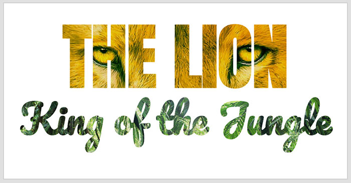
制作这个特效的基本HTML结构如下:
<div id="clipped-title1">
   <h1>THE LION</h1>
</div>

<div id="clipped-title2">
   <h1>King of the Jungle</h1>
</div>
在CSS代码中,将使用background-clip属性来剪裁文本。对两个div元素分别使用不同的背景图片,并通过webkit-text-fill-color属性设置为transparent,确保文字的填充色为透明色。
#clipped-title1 {
  background: url(../images/lion.jpg) no-repeat center center;
  background-size: cover;
  color: #fff;
  -webkit-text-fill-color: transparent;
  -webkit-background-clip: text;
}

#clipped-title2 {
  background: url(../images/jungle.jpg)no-repeat top center;
  background-size: cover;
  color: #fff;
  -webkit-text-fill-color: transparent;
  -webkit-background-clip: text;
  cursor: pointer;
}

#clipped-title1 h1 {
  font-size: 200px;
  font-family: Anton, sans-serif;
  text-align: center;
  -webkit-transition: text-shadow 1s ease;
  text-shadow: 0 0 1px rgba(0,0,0,.1);
  margin: 0;
  padding: 0;
}

#clipped-title2 h1 {
  font-size: 110px;
  font-family: Pacifico, sans-serif;
  text-align: center;
  -webkit-transition: text-shadow 1s ease;
  text-shadow: 0 0 1px rgba(0,0,0,.1);
  margin-top: -75px;
  padding: 0;
}
使用Webkit Mask-Image属性创建遮罩文字
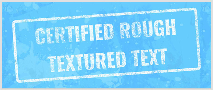
通过-webkit-mask-image属性,你可以在文字上设置图片,制作这个特效的HTML结构如下:
<div id="masked-image">
     <h1>CERTIFIED ROUGH<br/>TEXTURED TEXT</h1>
</div>
在CSS中,简单的设置一些基本的CSS样式,然后通过-webkit-mask-image属性来为文字设置图片纹理。
#masked-image {
    font-family: Oswald, sans-serif;
    font-size: 100px;
    color: #fff;
    text-transform: uppercase;
    border: 14px solid #fff;
    border-radius: .2em;
    text-align: center;
    margin: 0;
    display: block;
    -webkit-mask-image: url(../images/rough-texture.png);
    -webkit-transform: rotate(-4deg);
    -moz-mask-image: url(../images/rough-texture.png);
    -moz-transform: rotate(-4deg);
    -o-mask-image: url(../images/rough-texture.png);
    -o-transform: rotate(-4deg);
    mask-image: url(../images/rough-texture.png);
    transform: rotate(-4deg);
}